Different countries, different customs: International Packaging Trends (When in Rome, do as the Romans do)

>>pack’s!<< Swiss Packaging Newsletter, Packaging trends Although some marketing managers won’t believe it, 74 percent of buying decisions for consumer goods are made at the point of sale (POS), and up to 60 percent are made on the basis of product packaging and presentation. In an era when media budgets for mass media consistently miss […]

>>pack’s!<< Swiss Packaging Newsletter, Packaging trends

Although some marketing managers won’t believe it, 74 percent of buying decisions for consumer goods are made at the point of sale (POS), and up to 60 percent are made on the basis of product packaging and presentation.

In an era when media budgets for mass media consistently miss the mark with increasingly differentiated target groups, and ambitious Internet campaigns serve only as a highlight in annual reports, the visual and touchable appearance of a product is the manifestation of a brand more than ever. It is only the packaging of a product that has the direct, immediate connection with the consumer.

Crosscultural awareness

While general packaging trends remain relatively apparent and are respected my many branding experts, expansion into different cultures often creates serious problems. The design agency, kakoii, with offices in Berlin and Tokyo, has many international clients and knows how to navigate the changing cultural landscape of international markets. In order to reach consumers there, it is of the utmost importance that international brand managers adapt their packaging to the specifics of local markets. «This requires sensitivity toward crosscultural awareness on the part of corporations and agencies», according to Thekla Heineke, Creative Director of kakoii.

«Packaging that is successful with customers in Germany may already be interpreted differently in France. In Russia or Japan, it may not work at all. Even in an increasingly global society, it is important to differentiate between the various cultural traditions that define markets.»

There are the classic pitfalls of design psychology. For example, the fact that the color white, which in central Europe is used to communicate purity and cleanliness, is the color of death in some Asian countries. However, the complex cultural and social intricacies that need to be observed in order for a brand to be truly successful are even more sophisticated, per Heineke.

From Central Europe . . .

After years of packaging and communication overload in terms of advertising, a clear trend toward simplicity and elegance has crystallized in Central Europe. The Loha-target groups (“Lifestyle of Health and Sustainability”) have leveled the playing field here. «Consumers are looking for reduced complexity. What sells product is simple, distinct packaging that radiates authenticity and significance », observes Heineke, referring to Apple packaging and numerous new organic brands. This is the strategy kakoii is currently pursuing for the brand development of a new French premium mineral water that will compete in a hot, contested market. In this market, bottles are often created by star designers, and the cost of a half-liter bottle generally does not exceed 15.00 Euro.

… over Russia…

The Russian market, on the other hand, is characterized by a consistently growing upper echelon of higher-wage earners who are particularly focused on expensive, foreign brands. Coffee packaging designed by kakoii for the Russian market incorporates the preferences of well-to-do, luxury-oriented, male Russians: the brand was clearly positioned as an imported luxury label, and using local focus groups, the brand was refined until the perfect blend of opulence and machismo was attained.

…to Japan

Design development for the Japanese market continues to reign as the supreme discipline of packaging. In the country traditionally known for packaging design, there are highly differentiated packaging strategies. While lower-priced items are packaged in a Manga-style that Europeans deem adventurous at best, there is a clear correlation between price and simplicity of packaging: the higher the price of a product, the greater the reduction in design. The cosmetic brand, Shiseido is the perfect example of this trend. It was at Shiseido where Thekla Heineke learned her craft in packaging design in Japan, and where she developed numerous cosmetic lines for kakoii Tokyo.

More

The products of tomorrow – current packaging trends

Packaging Experts Directory 01/2007 […] Up to 74% of purchasing decisions are made at the POS (point of sale) – and up to 60% are made based on product packaging and presentation. In order to reach consumers of various cultural backgrounds, it is of the utmost importance that international branding managers adapt their packaging to […]

Packaging Experts Directory
01/2007

[…] Up to 74% of purchasing decisions are made at the POS (point of sale) – and up to 60% are made based on product packaging and presentation. In order to reach consumers of various cultural backgrounds, it is of the utmost importance that international branding managers adapt their packaging to local market specifics. This requires sensitivity and “crosscultural awareness” on the part of corporations and agencies.

“Packaging that is successful with customers in Germany may not work as well in France, and will probably not work at all in Russia,” observes Stefan Mannes, Managing Director of the agency, kakoii, in Berlin. According to the expert, even in an increasingly global society, it is important to differentiate between the various cultural traditions that define markets. In order to develop internationally customer-centric packaging, packaging trends should not solely be observed from a national perspective.

With offices in Germany and Japan, kakoii serves numerous national and international clients in the areas of packaging and corporate design. […]

More

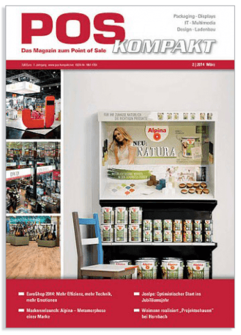
Cover story Alpina in POS-Kompakt (Point of Sale-Compact)

POS-Kompakt: Markenrelaunch bei Alpina Farbe

Our Alpina project made the cover of the renowned trade magazine POS-Kompakt, which reports: The Berlin agency, kakoii, was commissioned with the international brand relaunch of Alpina. The expansion of the company’s product palette, which will lead to a stronger presence at the POS (point of sale), includes the addition of the eco-friendly specialty line, […]

Our Alpina project made the cover of the renowned trade magazine POS-Kompakt, which reports:

Cover story Alpina in POS-Kompakt

The Berlin agency, kakoii, was commissioned with the international brand relaunch of Alpina. The expansion of the company’s product palette, which will lead to a stronger presence at the POS (point of sale), includes the addition of the eco-friendly specialty line, “Natura.”

POS kompakt is the trade journal for all topics, products & services regarding point of sale.

Target audiences include decision makers in the retail and consumer goods industry, leadership in trade marketing, personnel responsible for the purchasing of advertising materials or the hiring of advertising, creative, or other promotional agencies, below-the-line specialists, convention booth and store builders, architects, associations, trade fair organizations, and market research groups.

The magazine reports on brands, retailers, packaging, POS materials, digital signage, multimedia, POS design, advertising, communication, strategies, analysis for point of sale, and offers a comprehensive overview of all relevant aspects of sell-in, sell-through, and sell-out.

More

Luxury cosmetics in a tetra-pack

Moving boxes, cans, milk jugs, medication bottles – more and more, designers are putting their scents and cosmetics into ordinary packaging. A review. DiePresse.com, 27.09.2007 (ThePress.com, 9/27/2007) (…) Visions of the tetra-pak were floating in designer Thekla Heineke’s head as she developed the packaging for a hair coloring product by Shiseido. The new feature of […]

Moving boxes, cans, milk jugs, medication bottles – more and more, designers are putting their scents and cosmetics into ordinary packaging. A review.

DiePresse.com, 27.09.2007 (ThePress.com, 9/27/2007)

(…) Visions of the tetra-pak were floating in designer Thekla Heineke’s head as she developed the packaging for a hair coloring product by Shiseido. The new feature of “Tasting Tone” is its quick and uncomplicated use, and this is precisely what Heineke wanted to highlight. “The familiar shape of a tetra-pak represents the simple, daily use of a product”, says the designer, along the lines of: open, use, and toss. She explains that the strategy to use cheap, or at least ordinary, packaging for luxury cosmetics represents a quest for understatement. Thekla Heineke designs for the Berlin-based agency, kakoii, which is also responsible for the design of the cosmetics line “FSP” by Shiseido. FSP’s foil closures, which do not instill a sense of exclusivity and seem familiar since we are used to seeing them on medications, also play on the aesthetics of the ordinary. Heineke describes the attraction of products designed in this manner as: “It is not high-end, but insiders know nonetheless that it is expensive.”

More

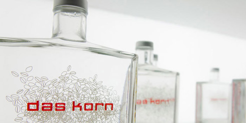
Our packaging for “Das Korn” (The Grain) on TheDieline Packaging

Unser Packaging für "Das Korn" bei TheDieline Packaging

We are very pleased to announce that today, our packaging design for Theo Ligthart’s “Das Korn” was listed on the most important international packaging design portal, TheDieline. Let’s have a Korn to that – Cheers! Feature at theDieline.com Profile of project: “Das Korn”

TheDieline Packaging

TheDieline Packaging

We are very pleased to announce that today, our packaging design for Theo Ligthart’s “Das Korn” was listed on the most important international packaging design portal, TheDieline. Let’s have a Korn to that – Cheers!

More
Mehr News laden